Case Study
Designing a Complex Multiplatform Product

The Product
Inspect AR is a scalable AR platform for enterprises. It is used in various industries from manufacturing, transportation, life science, construction and automotive industry.
It has won the Best of Swiss apps award for 3 years.
The product is a multi platform supported and runs on many devices such as mobile platforms both Android and iOS, tablets, HoloLens 2, RealWear, and web. It supports the processes of training and onboarding, inspections, maintenance, and quality
assurance.
My Role
Senior Product Designer and Design Lead
My role on the product was to be responsible for all of the design decisions on the product and combine user needs with business goals.
The product is supported on 5 platforms: web, mobile (Android & iOS), tablets, HoloLens (while it lasted) and RealWear.

The Design Process


With Remote support being one of the features, the product is a solution that allows users to quickly and efficiently solve problems in the field. The product is in a state of constant improvement and development, with new features and functionalities being added based on user and market needs. I have joined as the lead product designer four years ago and managed to improve the design by carefully listening to client feedback, initiating new processes that will improve the feedback loop, as well as conducting deep research and analysis of the market to find areas of improvement. The design approach has always been iterative with close contact to the end users. With a pool of customers that supports the process and is willing to participate in close interviews, design reviews, surveys, or any other means of communication that help me uncover the right problems and areas of improvement.
Since I took over the design, there have been dozen of new features, hundreds of design improvements and updates, and I also initiated a rebranding on all of the platforms to freshen up the product. As a Product Designer, I focused on solving immediate UX issues such as the confusing or non-existent navigation, restructuring features based on user findings, improving functionalities, especially those designed by developers, as well as creating a user feedback and testing process that has solidified the existing client base and created a good relationship, as well as helped onboard new clients and users.
Redesign & Improvements


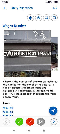
Among the few improvement tasks was the redesign of a key element of the application, which is the Checkpoint Screen, where a user sees the instructions and details of each checkpoint and is guided to perform the daily work. This screen was disorganized, with no clear hierarchy, and main functionalities like the use of the camera for localization were obstructed, or the access to the much-needed comments was hidden, as well as the confusing navigation was just a few of the pain points that were causing a lot of issues for the users.
After conducting some surveys, interviews, AB testing, and prototypes that I showcased to a group of users, I were able to completely redesign the screen as well as improve the inspection flow. Since then, I have gone through several minor adjustments and iterations, and received very positive feedback about the improved state, and satisfied the users with improved and easier user flow.
OLD

NEW

OLD
NEW


*Designs from iOS Platform


*Designs from Android Platform
Checkpoint Details without an active AR session. The details are cramped, the navigation is confusing and barely visible.
Checkpoint Details without an active AR session. Now the details are available with a scroll function. The additional functionalities are placed on top. The navigation is bellow.
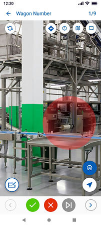
Checkpoint Details with active AR session and expanded details. Barely visible expandable section and hidden instructions.
Checkpoint Details with an active AR session. The main functionality is the camera. Other options are tucked away. No unnecessary clutter.
Big Feature Redesign
One of the most prominent features of the product is the issues feature. The ability to report an issue in the field was a much-needed feature for most clients. Unfortunately, due to unclear requirements and confusions about priorities, the feature was somewhat unused and very confusing to new users.
Here are some of the old designs that were confusing and misleading:


The only visible sign of an issue was the disruptive banner that only showed once, an only when you land on a checkpoint with issues.
Once you see the banner there was only an icon on top with a small indicator that the issue was still present
A checkpoint with issues has some background but the resources are completely taken from the checkpoint. No specific issue data.
There was an additional functionality to link issues together that even the team did not quite understand how it worked.
And let's not even mention the weird UI.
Main Problem(s)


Designed with no research and users in mind, this feature was a hot mess. It wasn't usable, there was no clarity, and a whole lot of complexity.
Hidden access points, useless descriptions, pop-up messages, and complex logic caused the feature to sit idle and no one wanted or even knew how to use it.
Here are just a few obvious problems this feature had:
Complexity
Visibility
Unclear use case
No user group
No testing
Poor Navigation
Start small


The first step was rediscovering the purpose of the feature. The idea was useful, but the execution was not. So I started with questions. And lots of them. Some examples of the questions I asked were:
Who is the user group for this feature specifically?
Turns out the user group was completely different industry then the one the feature was built for. The first attempt was made for the transportation industry, but close, (or not so close), the actual user group was from the automotive industry. They had a specific case in mind, and I centered on understand it thoroughly before doing any actual work.
What are their main pain points?
Working with the right user group and especially with a representative straight from the front lines meant that I was able to discover the right pain points. A few of them were:
-
No centralized tool for reporting and reviews
-
No tool for audits
-
Not able to report an issue directly on the factory floor
-
No ability to locate issues and navigate to them to resolve
What is their use case?
An important question to ask, since the product is serving many industries, not just the automotive industry. Shaping the feature for the automotive industry would mean we could possibly repeat the same mistake. We will build a feature just for a specific user group and it would not work for the rest of our users coming from other industries.
Their use case was simple:
As users of the application, they wanted to be able to report problems as they happen on the factory floor so that managers can review them and assign someone to fix the problem.
What are the requirements? (Client and Business)
As I mentioned before. It was important to keep the product in mind and combine a feature that meets not just user goals but also business goals. So together with our PO, we defined and prioritized the requirements:
-
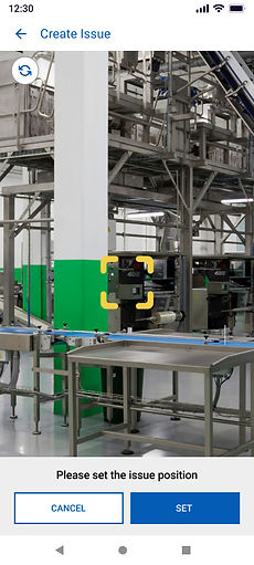
The feature should allow users to Create an Issue
-
The feature should allow the users to Set Issue Position
-
The feature should allow the user to Report the Issues
-
The feature should allow the user to Review Issues
-
The feature should allow the user to Manage Issues
The process


After gathering a ton of user data and defining the requirements, I started with the usual process of ideation and creation. I always use pen and paper as a starting point. So I drafted ideas, wrote down important phrases to keep me on the right path, and make sure I don't forget anything.
Wireframes & Feedback
I did a ton of wireframes to connect the entire flow and present the idea to stakeholders. First came the PO and CEO who reviewed the flow and provided feedback, then I reached out to the development team to check for feasibility and constraints, and after reached out to the user base that provided the key input that shaped the feature. I am a strong proponent of asking for and receiving feedback early on.
Iteration
After I gathered the feedback, it was time to iterate on the flow, correct the designs, and then combine them start on the semi-final stage of high fidelity designs.
High Fidelity and Prototype
So I have worked out all of the details, gathered the stakeholders for opinion and feedback, did a couple of rounds of iteration, and once I was ready, combined the flow in high-fidelity screen designs. Worked a lot on the prototype to be able to showcase it to the client, and boom, instant satisfaction (yeah, right). Honestly, it took a while to get all of the details, all of the dependencies, and designing for 5 different platforms is never easy. Especially if you do it alone. But I somehow managed to combine everything, and in the end, we got the result we wanted. The feature was designed, approved, and ready to be taken over by development.
Coordination and Cooperation
Design work hardly ever stops at the flow and high fidelity design approval. After development took over, I was always there to help and support. After all, a team effort makes a product great.
The Solution


I added a new access point for the Issues in the bottom navigation of the app. There, the users could preview their active issues, other issues from their team, as well as past issues that are now resolved.
*Designs from Android Platform


Then I added the Issue Creation process that meant users can add specific data for each issue, set the Issue Position, and then assign it to a user.


Setting the position was a big requirement, and since the app already allows users to set a position for checkpoint, which is a key element of the app itself, the infrastructure for the Issue Position was already in place.


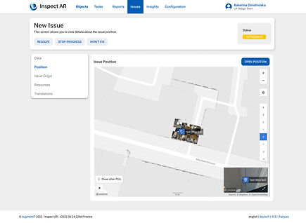
The web platform was also improved with the addition of a separate place to review the Issues in the Tab Bar, as well as specific data for each Issue like basic information, origin, and resources. Now users can also create issues from the web and then assign them to workers in the field.
*Designs from Web Platform


New Platforms
As a product that offers AR support, Inspect AR also runs on RealWear. That is a device used specifficaly by workers on the field when their hands are busy doing other tasks. They need a hands-free device, and RealWear offers just that. It is voice controlled device that can be operated completely hands-free. This means that users will be able to do their work and review instructions without having to hold a phone or tablet. The device is alo lightweight and can be worn under a hardhat.
But a device such as the RealWear poses a lot of design challenges. The unusual interaction method is just one. The screen real estate is another. The visibility and clarity are a whole other problem. And devices like the RealWear have also limited design guidelines to learn and use. So most of the work is experimental and requires a lot of testing and adapting.
And that is exactly what I did with this platform. The design is a continuous adjustment and requires constant maintenance so it is usable and useful to the end users. Among the maintenance and new features, there was also a requirement to integrate Hardware button interaction with the use of just three buttons available on the device. After many attempts and testing options, I was able to design a solution that worked seamlessly and was clear to understand, even from users who have never tried the device and product.
OLD

NEW
Help Overlay


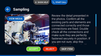
The Checkpoint Screen, where users check instructions that need to be executed on site. The redesign is based on user research and pain points. Namely, the action buttons were not clear, the voice commands were not visible, the comments and guidance were seldom used and therefore I placed them in the help overlay that can be called at all times.

All Tasks

Camera

Task Details

New Photo

The Outcome
This is just a small part of the continuous work done on the product. In my four years, I have worked seamlessly on maintaining and organizing the design files for all platforms, offering features and improvements for all platforms as well as establishing a solid relationship with sales and most importantly the clients which are the main users. When I arrived, there was no existing user base to test and confirm the design decisions.